

最近看到很多童鞋吐槽鸿蒙自定义弹窗的实现,也有不少童鞋提供了各式各样的低耦,轻巧方向的优化方案,但多数参差不齐,甚至有基于老API(白玩,以后还得废弃掉...)给的方案,为避免如此“乱象”遂提出正确的实现姿势。
姿势一
如果您没有特别的要求,系统AlertDialog(API 6+)完全够用
代码示例:
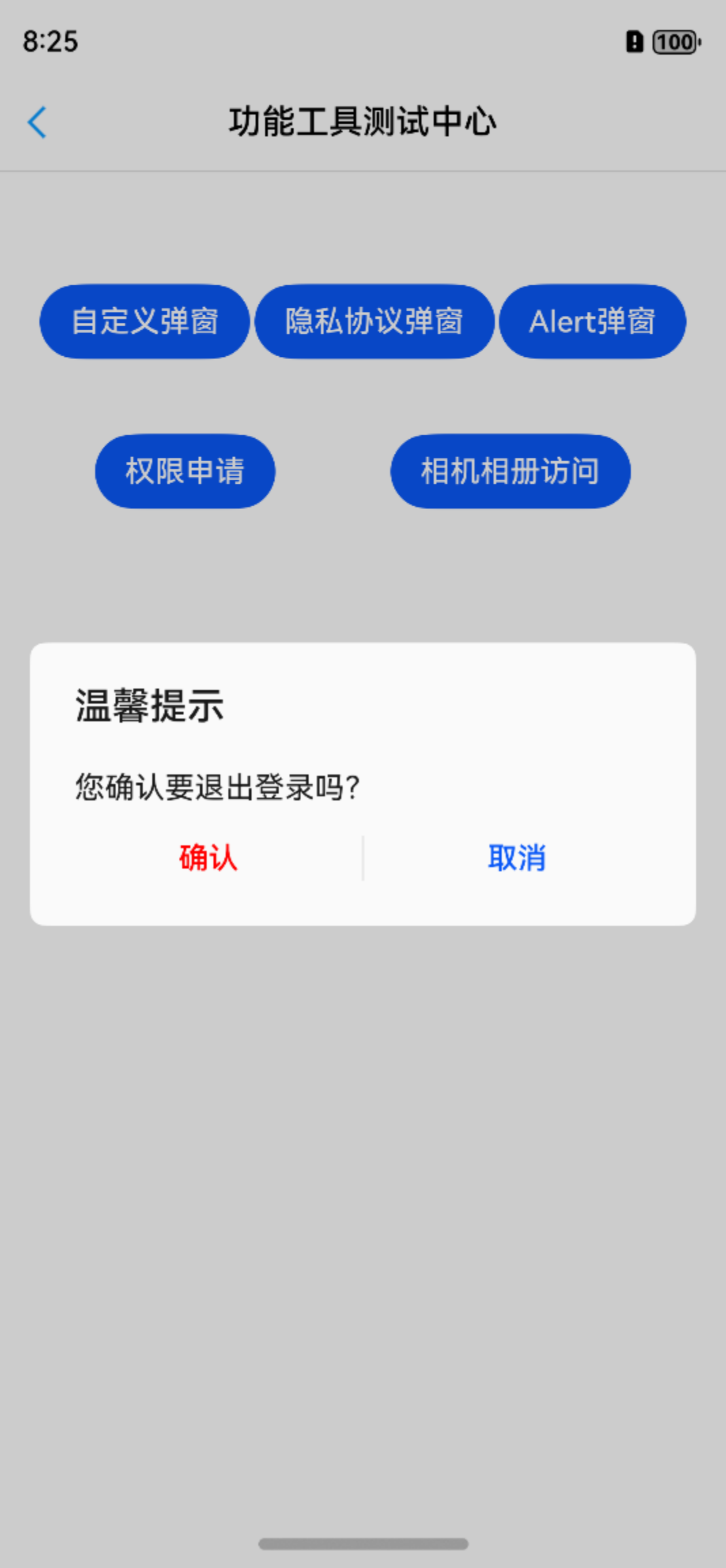
AlertDialog.show({
      title: '温馨提示',
      message: '您确认要退出登录吗?',
      autoCancel: true, //点击窗口外边是否自动关闭
      alignment: DialogAlignment.Center, //弹窗位置
      cornerRadius: 8,
      primaryButton: {
        value: '确认',
        action: () => {
          toast.show('点击了确认按钮')
        }
      },
      secondaryButton: {
        value: '取消',
        action: () => {
          toast.show('点击了取消按钮')
        }
      },
      cancel: () => {
          toast.show('点击弹窗外导致的取消回调')
      }
    })
效果是酱紫的:
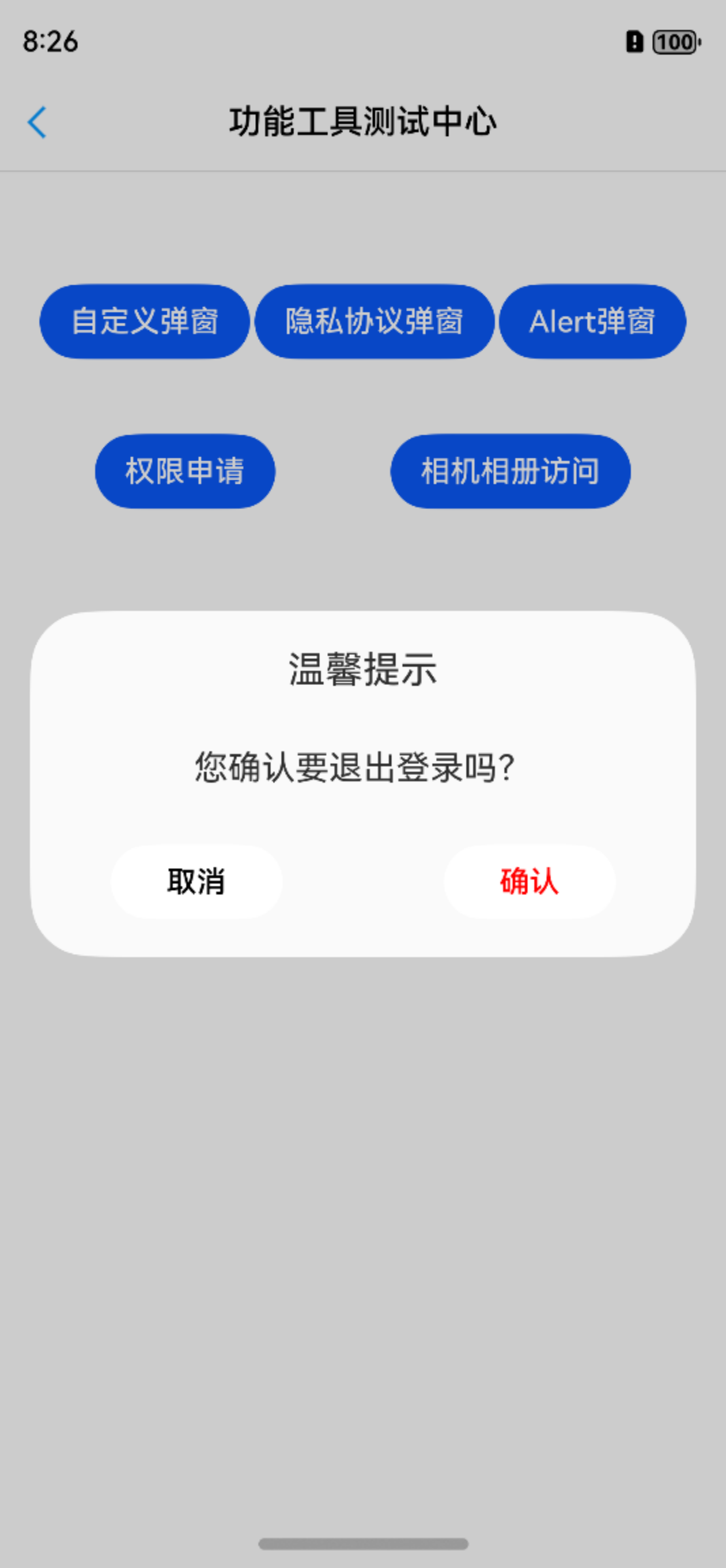
系统AlertDialog还可以定制一些特别的样式:
具体就不代码举例了,感兴趣的童鞋可以参考官网demo哈
姿势二
很多时候,系统AlertDialog并不能满足精致化的业务需求,那么API 7给您带来了饱受诟病和吐槽的CustomDialog(API 6+)来方便开发者自定义弹窗
代码示例:
@CustomDialog
@Preview
export struct CommonDialog {
  title: string | Resource = "温馨提示"
  msg: string | Resource = ""
  confirm: string | Resource = "确认"
  cancel: string | Resource = "取消"
  controller?: CustomDialogController
  onCancel: () => void = () => {
  }
  onConfirm: () => void = () => {
  }

  build() {
    Column({ space: 30 }) {
      Text(this.title)
        ......

      Text(this.msg)
        ......

      Flex({ justifyContent: FlexAlign.SpaceAround }) {
        Button(this.cancel)
          .onClick(() => {
            if (this.controller) {
              this.controller.close()
              this.onCancel()
            }
          })
          ......

        Button(this.confirm)
          .onClick(() => {
            if (this.controller) {
              this.controller.close()
              this.onConfirm()
            }
          })
          ......
      }
    }
  }
}
然后在组件中配置和唤起:
@Entry
@Component
struct ToolTestPage {
  private dialogController: CustomDialogController = new CustomDialogController({
    builder: CommonDialog({
      onCancel: () => {
        toast.show("你点了取消")
      },
      onConfirm: () => {
        toast.showLong("你点了确认")
      },
      title: "温馨提示",
      msg: "您确认要退出登录吗?",
      cancel: "取消",
      confirm: "确认",
    })
  })

  build() {
  ......
    Button('自定义弹窗')
      .onClick(() => {
        this.dialogController.open()
      })
  ......
  }
}
运行效果:
有童鞋就问了,为什么不把属性dialogController收到封装控制类里去呢?哥,我也想啊,鸿蒙不让啊(它会让你报错,跑不起来)
来看下官方文档说明:
CustomDialogController仅在作为@CustomDialog和@Component struct的成员变量,且在@Component struct内部定义时赋值才有效。
再来看官方解释:
CustomDialogController作为UI的一部分必须在Component中使用是非常合理的,因为view是树形结构,dialog不能脱离window独立存在。
统一调用router.push方法并且处理错误中弹窗,开发者可以自己在Component中写回调。
这是哪位“大佬”的“牛逼”设计啊?不敢想象,如果业务弹窗再复杂些,或者组件里搞多个弹窗,代码是有多酸爽~~~
好了,不吐槽了,反正我只用“姿势三”...
姿势三
好在官方貌似意识到了这个问题,在API 12的PromptAction里支持了全局自定义弹框openCustomDialog,不要太舒服~
代码示例:
export class PrivacyDialog {
  static show(context: UIContext, dialogParam: DialogParam) {
    const contentNode = new ComponentContent(context, wrapBuilder(buildDialogComponent), dialogParam);
    const promptAction = context.getPromptAction()
    const funcConfirm = dialogParam.onConfirm
    dialogParam.onConfirm = () => {
      promptAction.closeCustomDialog(contentNode)
      if (funcConfirm) {
        funcConfirm()
      }
    }
    let funcCancel = dialogParam.onCancel
    dialogParam.onCancel = () => {
      promptAction.closeCustomDialog(contentNode)
      if (funcCancel) {
        funcCancel()
      }
    }

    promptAction.openCustomDialog(contentNode, {
      alignment: DialogAlignment.Center,
      autoCancel: false
    });
  }
}

@Builder
function buildDialogComponent(param: DialogParam) {

  Column() {

    Image($r("app.media.user_login_ic_close"))
      ......
      .onClick(() => {
        param.onCancel()
      })

    Text("个人信息保护政策更新")
      ......

    Scroll() {
      Text(param.content ? param.content : $r("app.string.wcb_privacy_reminder"))
        ......

    }

    Column() {

      Divider()
        ......

      Text() {
          Span('请阅读')
          Span('《个人信息保护政策》')
            .fontColor($r('app.color.text_blue1'))
            .onClick(() => {
              ToastUtils.show("个人信息保护政策")
            })
          Span('了解详细内容,我们将按此政策收集、使用和保护您的信息')
      }
      ......

      Text("确认并继续")
        ......
        .onClick(() => {
          param.onConfirm()
        })

      Text("暂不同意")
        ......
        .onClick(() => {
          param.onCancel()
        })

    }
    ......

  }
  ......
}

interface DialogParam {
  content?: string | Resource
  registerUrl?: string
  privacyUrl?: string
  onConfirm: () => void
  onCancel: () => void
}
然后在组件中唤起:
@Entry
@Component
struct ToolTestPage {
  ......
  build() {
  ......
    Button('隐私协议弹窗')
              .onClick(() => {

                PrivacyDialog.show(this.getUIContext(), {
                  content: $r("app.string.wcb_privacy_reminder"),
                  onConfirm: (): void => {
                    ToastUtils.show("用户同意了")
                  },
                  onCancel: (): void => {
                    ToastUtils.show("用户暂不同意")
                  }
                })

              })
  ......
  }
}
运行效果:
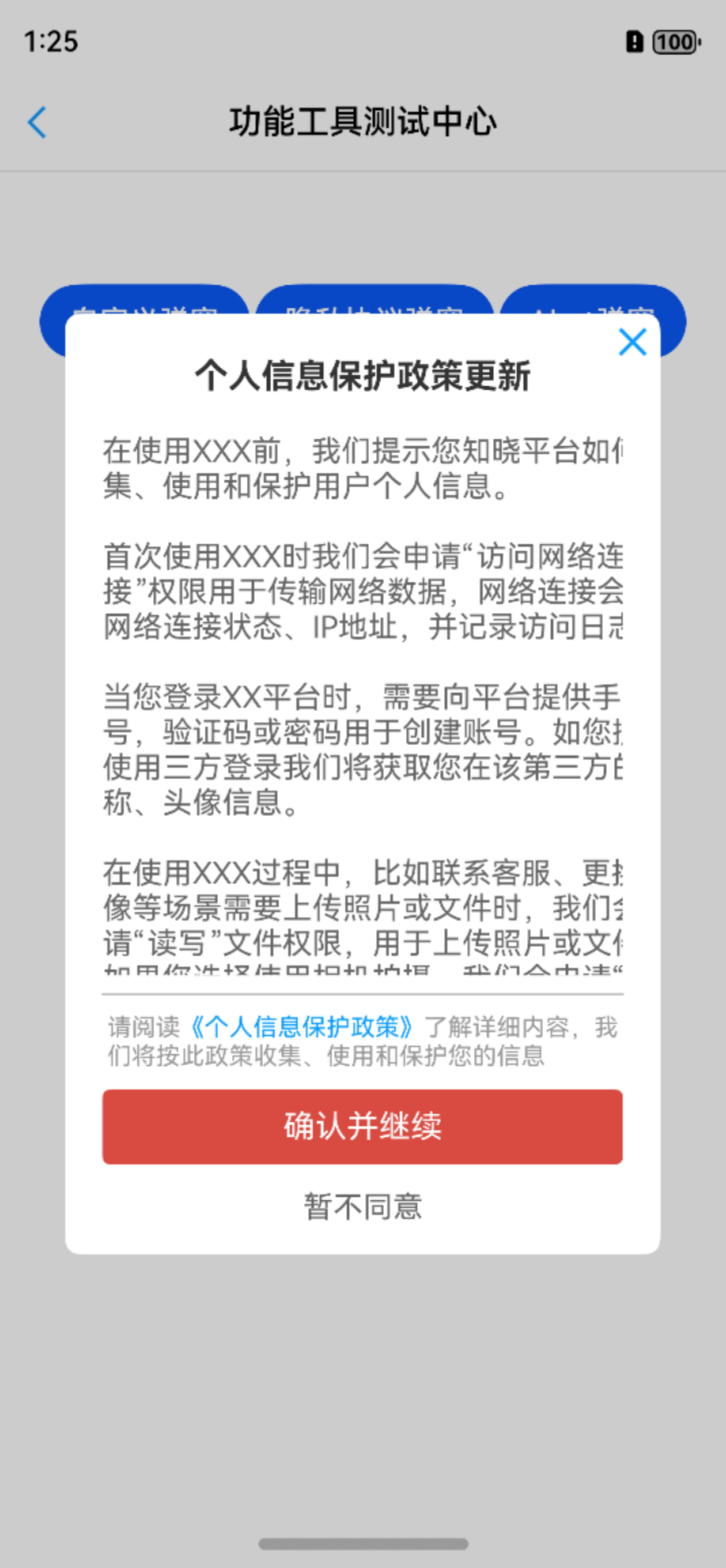
舒服了~
童鞋们,姿势三玩起来吧~~~


- 最新
- 最热
只看作者